By Beth Bacon
This is the third post in a series honoring reluctant readers.
Writing conveys a full spectrum of experiences and emotions—but are there limits to what words alone can do? When digging deeper into the building blocks of literacy, you realize that letters and words are more than the ideas the represent. They’re physical entities too. Their shapes and designs can contain meaning.
One way to reach emerging readers is with a visual approach to storytelling. Authors who explore the relationships between words and images have a rich set of tools at their disposal.
Words can have shapes that enhance their meaning. Shapes and symbols can add new ideas to the words on the page.
Young people today are in many ways highly visually literate.
Perhaps more authors should take a visual approach to writing. The additional meaning conveyed by the imagery aids emerging readers in their quest for understanding. But more than that, it allows writers to express themselves in new ways.
 |
| Marianne Murphy |
Beth Bacon: You’ve written a memoir about your struggles with OCD as a child. Why did you choose to use the concrete poetry form to convey the story?
Marianne Murphy: I knew that I wanted to express my experience, because it was a very isolating time period for me and there isn’t a lot of narrative representation of childhood and adolescent OCD. But I was having a really hard time expressing my story in a traditional way, because that linear, logical, structured path is not how I was processing my thoughts at the time.
It became clear to me that it had to be visual because some parts of the experience were indescribable through words alone, and I found that the chaos of concrete poetry helped me access and recall a lot of the rawness of the experience.
Can you talk about how the visuals in your story make meaning?
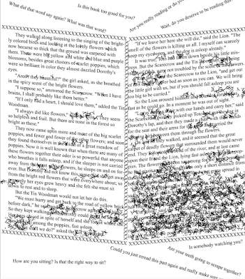
Marianne Murphy: One of the first visuals that came out while I was writing was the repeating Y to represent obsessive thoughts.
 |
| A page of concrete poetry from Bad Thoughts. |
Beth Bacon: You say you weren’t a reluctant reader as a child. What was your relationship with books when you were young? How often did you read, what types of books, and why? Did you perceive your reading habits as different from other kids?
Marianne Murphy:The biggest problem I encountered as a child was a lack of understanding and vocabulary to explain my experience and seek professional help, so abstract and surreal visuals were the only way I could even try to convey what was going on. That is still partially true today.
Beth Bacon: Meta fiction techniques break a book’s conventions. They are any self-referential elements that disrupt the text or boundaries of the book, refer to themselves, invite interactivity, and mock the rules of reading we work so hard to teach. For readers who feel marginalized, meta fiction can be affirming and empowering.
As a child, I used reading to escape from my reality, did you?
Marianne Murphy: I read all the time! For the most part I alternated between very visual, meta picture books like The Stinky Cheese Man and Other Fairly Stupid Fairy Tales by Jon Scieszka (illustrated by Lane Smith, Viking Press, 1992), and nonfiction like arts-and-crafts books, joke books, and biographies.
Beth Bacon: Books can be powerful allies to kids who feel like outsiders for any reason. There’s something very personal about the relationship between a reader and a book. And meta fiction draws attention to this relationship.
 |
| The Book No One Wants to Read makes a deal with the reader. |
In my new title, The Book No One Wants To Read, the book/narrator makes a deal with the reader: “What if you just sit here and turn my pages and we just goof off? I won’t tell anyone if you won’t.”
Marianne Murphy: For the most part, I wanted the fiction I read to be very visual and to have a strong word/image connection and balance, and I wanted the nonfiction I read to be strictly technical, structured, and real.
Beth Bacon: Can you talk about how you wrote this story? Did you write it out in straight sentences first then create the art? Did you sketch the designs from the start? What tools (software programs?) did you use to manipulate the sentences? What were your challenges artistically and technically?
Marianne Murphy: Every page started as a concrete poem!
 |
| Letters take on new meaning in Bad Thoughts. |
Beth Bacon: One theme in your story is the perception of being different from others. The amazing thing is, however, this story brings up universal feelings we all share.
Marianne Murphy: Thank you! The biggest surprise to me after showing this piece to friends and ultimately releasing the book was the fact that people could identify with parts of it or recognize these behaviors in their family members, especially since I’d felt so completely isolated about it for such a huge chunk of my life.
Beth Bacon: Marianne, you’re a writer unafraid to go beyond the conventions of YA novel in order to tell your story.
Cynsational Notes
Huge thanks to Beth Bacon for putting together this three-part series focusing on reluctant readers!
Beth Bacon is the author of books for reluctant readers including I Hate Reading (Pixel Titles, 2008, 2017) and The Book No One Wants To Read, illustrated by Jason Grube and Corianton Hale (Pixel Titles, 2017).
She earned an MFA in Writing For Children and Young Adults from Vermont College of Fine Arts.
Beth has won the VCFA Candlewick Award for Picture Book Writing, the Marion Dane Bauer Award for Middle Grade Writing, and is a PSAMA PULSE Award Finalist for marketing.


